# 使用指南
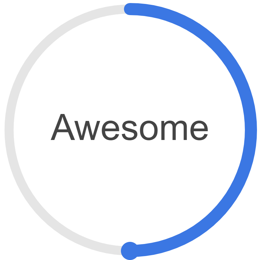
# 效果示意
基于vue和canvas的环形进度条组件,支持npm和script两种使用方式,支持和很多自定义的属性和动画效果,效果图如下

# 亲自试试
# 安装和使用
# npm引入
# 安装
npm install --save vue-awesome-progress
1
# 使用
# 全局注册
import Vue from 'vue'
import VueAwesomeProgress from "vue-awesome-progress"
Vue.use(VueAwesomeProgress)
1
2
3
2
3
# 局部引入组件
import VueAwesomeProgress from "vue-awesome-progress"

export default {
    components: {
        VueAwesomeProgress
    },
    // 其他代码
}
1
2
3
4
5
6
7
8
2
3
4
5
6
7
8
# 使用示例
<vue-awesome-progress
  circle-color="#e5e9f2"
  :circle-width="4"
  :line-width="4"
  :duration="2"
  :start-deg="0"
  :percentage="100"
  :show-text="false"
  easing="0,0,1,1"
/>

<vue-awesome-progress
  circle-color="#e5e9f2"
  :circle-width="4"
  :line-width="4"
  :circle-radius="60"
  :point-radius="0"
  :start-deg="270"
  :percentage="50"
/>

<vue-awesome-progress
  :circle-radius="100"
  :circle-width="4"
  :line-width="4"
  :font-size="24"
  :point-radius="6"
  :percentage="90"
  :duration="3"
  :format="formatPeople"
/>

<vue-awesome-progress
  :circle-width="6"
  :line-width="8"
  :duration="0.6"
  :font-size="24"
  :percentage="percent"
  :circle-radius="80"
  easing="0,0,.35,.43"
/>

<div class="btns__wrapper">
  <button @click="decrease">-</button>
  <button @click="increase">+</button>
</div>
1
2
3
4
5
6
7
8
9
10
11
12
13
14
15
16
17
18
19
20
21
22
23
24
25
26
27
28
29
30
31
32
33
34
35
36
37
38
39
40
41
42
43
44
45
46
2
3
4
5
6
7
8
9
10
11
12
13
14
15
16
17
18
19
20
21
22
23
24
25
26
27
28
29
30
31
32
33
34
35
36
37
38
39
40
41
42
43
44
45
46
格式化文字
formatPeople(percentage) {
  return Math.round(percentage / 100 * 7000) + '人'
}
1
2
3
2
3
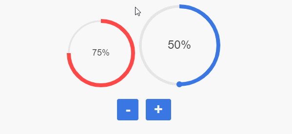
修改进度条的进度,只需要修改绑定的percentage属性的值即可
methods: {
    increase() {
        this.percent += 10;
        if (this.percent > 100) {
            this.percent = 100;
        }
    },
    decrease() {
        this.percent -= 10;
        if (this.percent < 0) {
            this.percent = 0;
        }
    }
}
1
2
3
4
5
6
7
8
9
10
11
12
13
2
3
4
5
6
7
8
9
10
11
12
13
# script标签引用
<!DOCTYPE html>
<html>
<head>
  <script src="https://cdn.bootcss.com/vue/2.6.10/vue.min.js"></script>
  <script src="path-to/vue-awesome-progress.min.js"></script>
</head>
<body>
  <div id="app"></div>
  <script>
    new Vue({
      el: "#app",
      template: '<vue-awesome-progress :percentage="40"></vue-awesome-progress>'
    })
  </script>
</body>
</html>
1
2
3
4
5
6
7
8
9
10
11
12
13
14
15
16
2
3
4
5
6
7
8
9
10
11
12
13
14
15
16
# 支持的组件属性
| 参数 | 说明 | 类型 | 是否必传 | 可选值 | 默认值 |
|---|---|---|---|---|---|
| percentage | 百分比 | Number | false | 0 | |
| start-deg | 开始角度 | Number | false | 270 | |
| circle-radius | 圆环的半径 | Number | false | 40 | |
| circle-width | 圆环的线宽 | Number | false | 2 | |
| circle-color | 圆环的颜色 | String | false | #e5e5e5 | |
| line-width | 进度弧线的宽度 | Number | false | 8 | |
| use-gradient | 是否使用渐变色绘制进度弧线 | Boolean | false | false | |
| line-color-stops | 进度弧线渐变色断点 | Array | false | [{"percent":0,"color":"#13CDE3"},{"percent":1,"color":"#3B77E3"}] | |
| line-color | 进度弧线颜色 | String | false | #3B77E3 | |
| show-text | 是否显示环内文字 | Boolean | false | true | |
| font-size | 环内字体大小 | Number | false | 14 | |
| font-color | 环内字体颜色 | String | false | #444 | |
| format | 文字格式化方法 | Function | false | ||
| point-radius | 圆点半径,值<=0则不显示圆点 | Number | false | 6 | |
| point-color | 圆点填充色 | String | false | #3B77E3 | |
| animated | 是否使用动画效果 | Boolean | false | true | |
| easing | 贝塞尔缓动函数,默认是ease-in效果 | String | false | 0.42,0,1,1 | |
| duration | 初始动画周期,单位为秒 | Number | false | 1 |